My Role / Research, Product Strategy, and Interface Design
Tools / Figma, Maze, Illustrator, Midjourney
Timeline / 4 Sprints (8 Weeks)
This was a four-sprint-long initiative to create a new feature from scratch. Collaboration was a key factor in our success with this project. I worked closely with the PM and Engineering Lead to gather project requirements and data before diving into the ideation and design phases.
My specific role included conducting interviews with clients and prospective clients. I also did a competitive analysis to see what Raydiant’s rivals were doing to solve this problem. I worked on all of the initial ideation sketches, mocks, and prototypes. After engineering completed their tasks, I supported QA with testing as well.
Raydiant is a retail technology company specializing in digital signage, kiosks, and location insights powered by AI. Raydiant’s flagship product is the Customer Experience Platform that lets customers manage their fleet of devices and content deployment.
For 6 years, Raydiant had focused on and cornered the small to medium business segment for their product. This had been lucrative, but they wanted to expand into the enterprise market and challenge their competitors for market share. Raydiant was unsure about the needs of these enterprise clients.
To provide a solution for enterprise customers that is tailored enough for their needs, we first need to understand more about the segment and what type of functionality they require. These requirements will need to be achieved without comprising support for existing customers.
How might we create a flexible, location-based screen management experience that seamlessly scales from small businesses with a single location to enterprise organizations managing hundreds — without compromising usability for either segment?

The Customer Experience (internally known as ‘CX’) platform excelled for small businesses and was even serviceable for some mid-market clients. As clients got bigger, the flaws in CX started to become more and more apparent. The product team began getting complaints from the customer success teams and sales about the functionality not being enough.
The top brass at Radiant considered this to be a top-priority issue. 2 KPIs were addressed with this project:
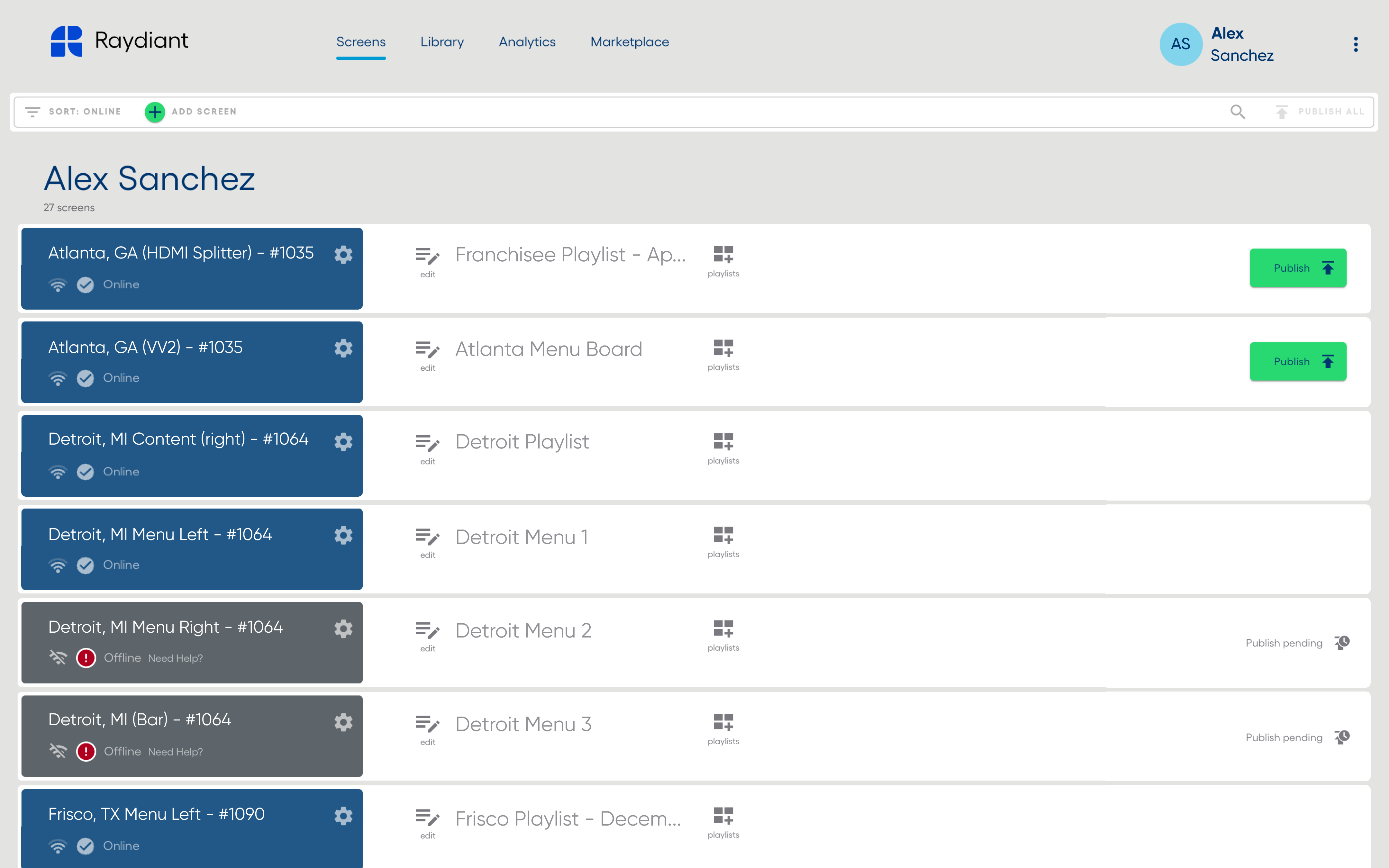
Above is the original design of Raydiant Customer Experience prior to this project.
The Customer Success team had a significant amount of feedback, that they shared with us. The sales team also shared their woes about deals falling through with enterprise clients due to our features not being up to par with competitors. We wanted to do some digging of our own to validate pain points, so my PM and I interviewed 12 customers and prospects across the hospitality, retail, and banking segments.

We benchmarked location management on platforms across the board. I looked at direct competitors, including Yodeck, Optisigns, Screencloud, and Popullo. I also explored how tech giants and comparitives approached this: Google My Business, Jamf, Intune, and Onfido.
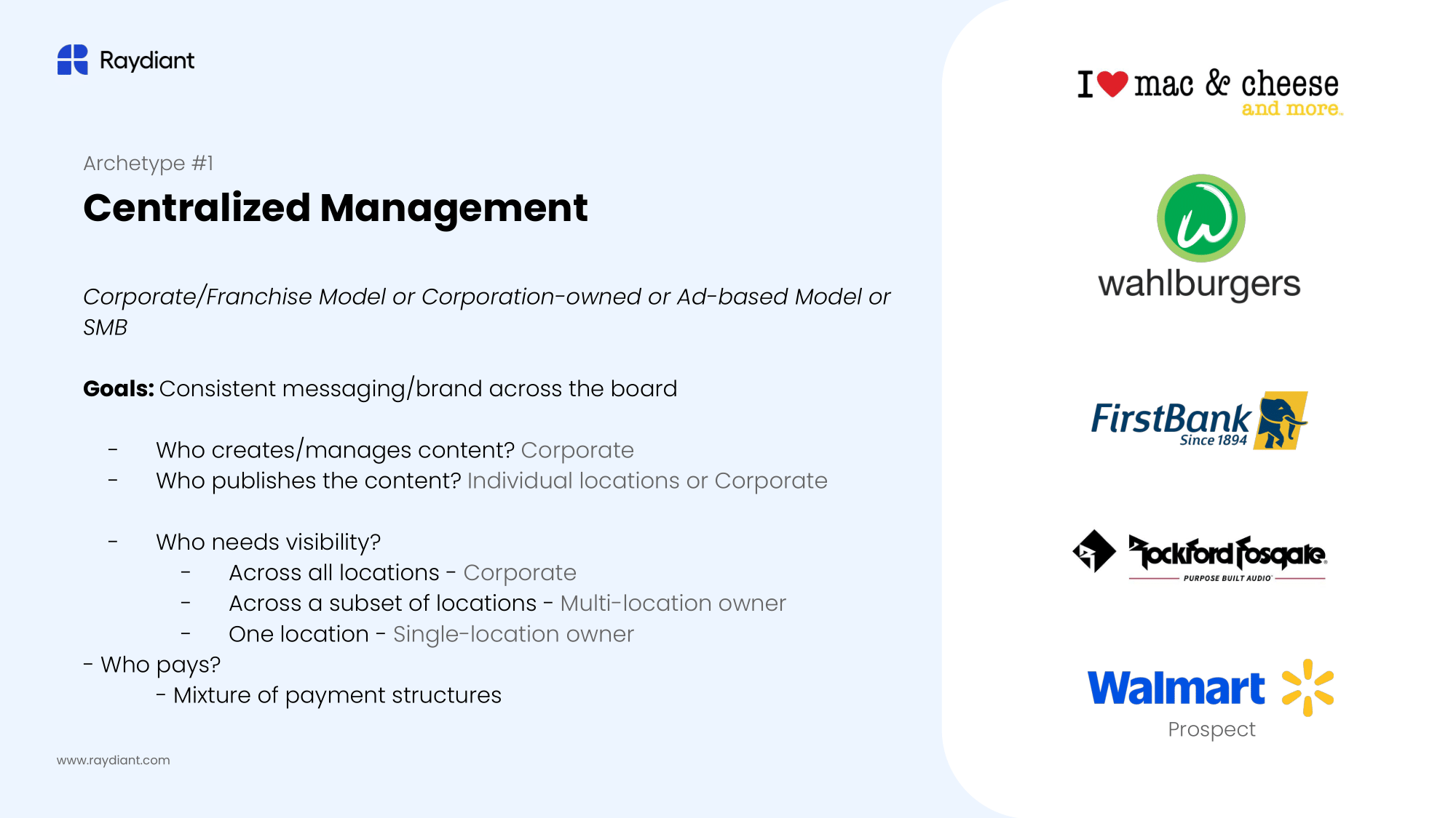
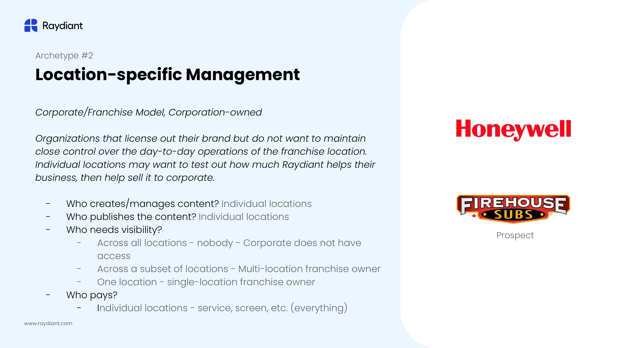
We quickly realized that not all of the enterprise customers were organized the same way. We established the following client archetypes to help us understand their needs. The three archetypes are:

After our many discussions with internal stakeholders, benchmarking competitors, and interviewing clients, we were able to boil it all down into a few key insights:
Additional considerations:
After gathering data and setting a problem space, I ran multiple workshops with my PM to better define our problem space and identify a viable solution. We invited the CPO and customer success agents, engineering leads, and some of our enterprise sales staff to jam.
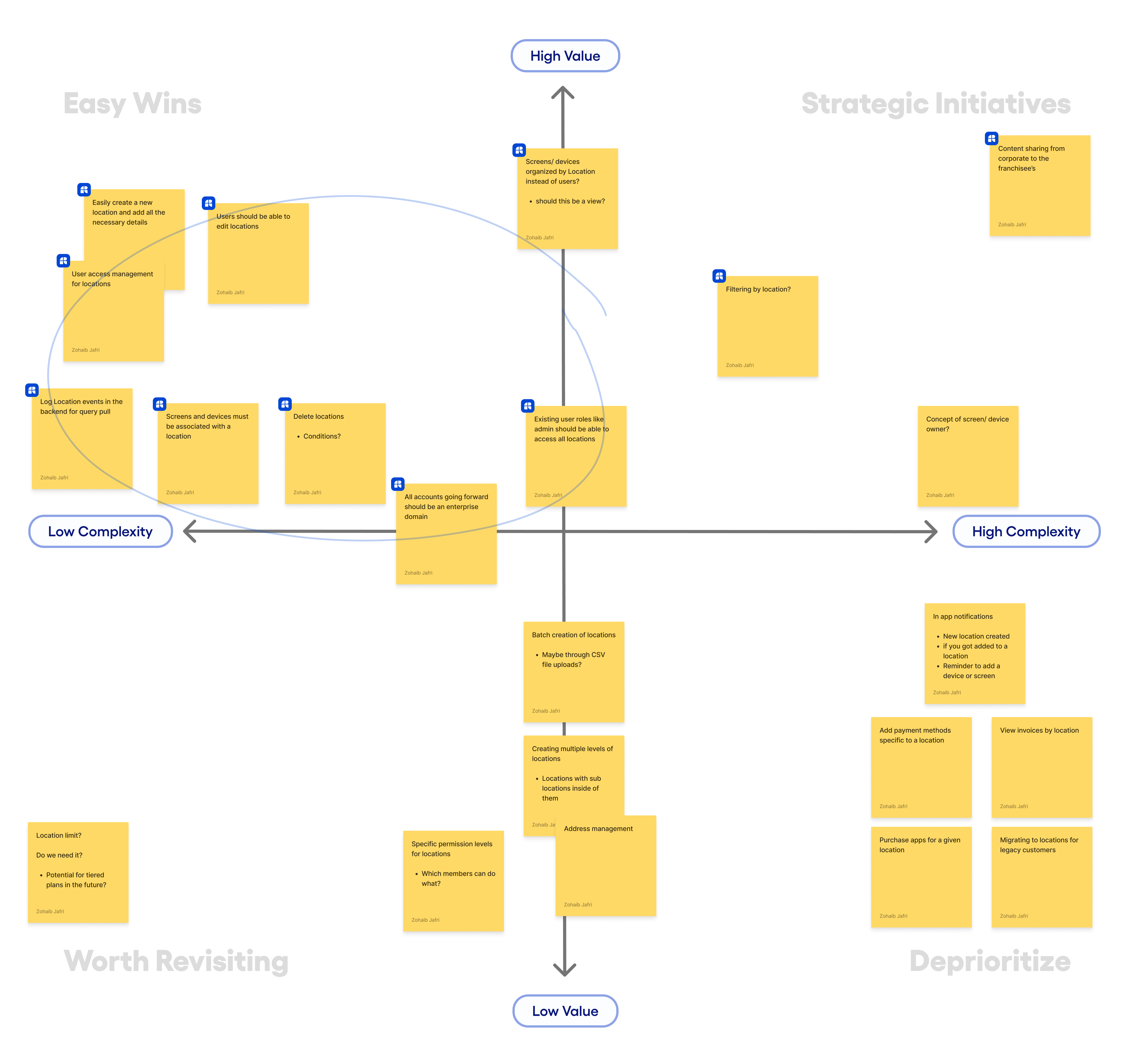
We prioritized finding an immediate, low-lift solution that would deliver greater value to our existing customers while also providing the essential functionality needed to help our sales team close deals.
I began with some low-fidelity sketches to explore potential solutions and facilitate early conversations with my PM and other stakeholders. We focused on moving quickly and iterating, which led to rough wireframes that helped bring more clarity to the concepts.


Once our internal team was aligned on the solution we would be building, I created a user flow diagram that we would use as a baseline for discussions. We primarily worked on a desktop experience along with a responsive mobile design for the 9% of users who access CX on their mobile devices.
We conducted internal user testing to ensure our proposed solution exceeded usability and business needs. We edge-tested with Customer Success and QA agents, as well as sales team members.
Other items we accounted for during this phase:
The initial concept placed the Locations feature in the Account Console, Raydiant’s settings hub. However, stakeholders agreed to move it to the Screens page since Locations are primarily used to organize screens, and managing them elsewhere felt disjointed.
We explored adding an in-app notification system to alert users about new locations, being added to a location, and reminders to add screens or devices. However, it was scrapped due to concerns that location-only notifications might confuse users, and the engineering team flagged it as a significant increase in project scope.
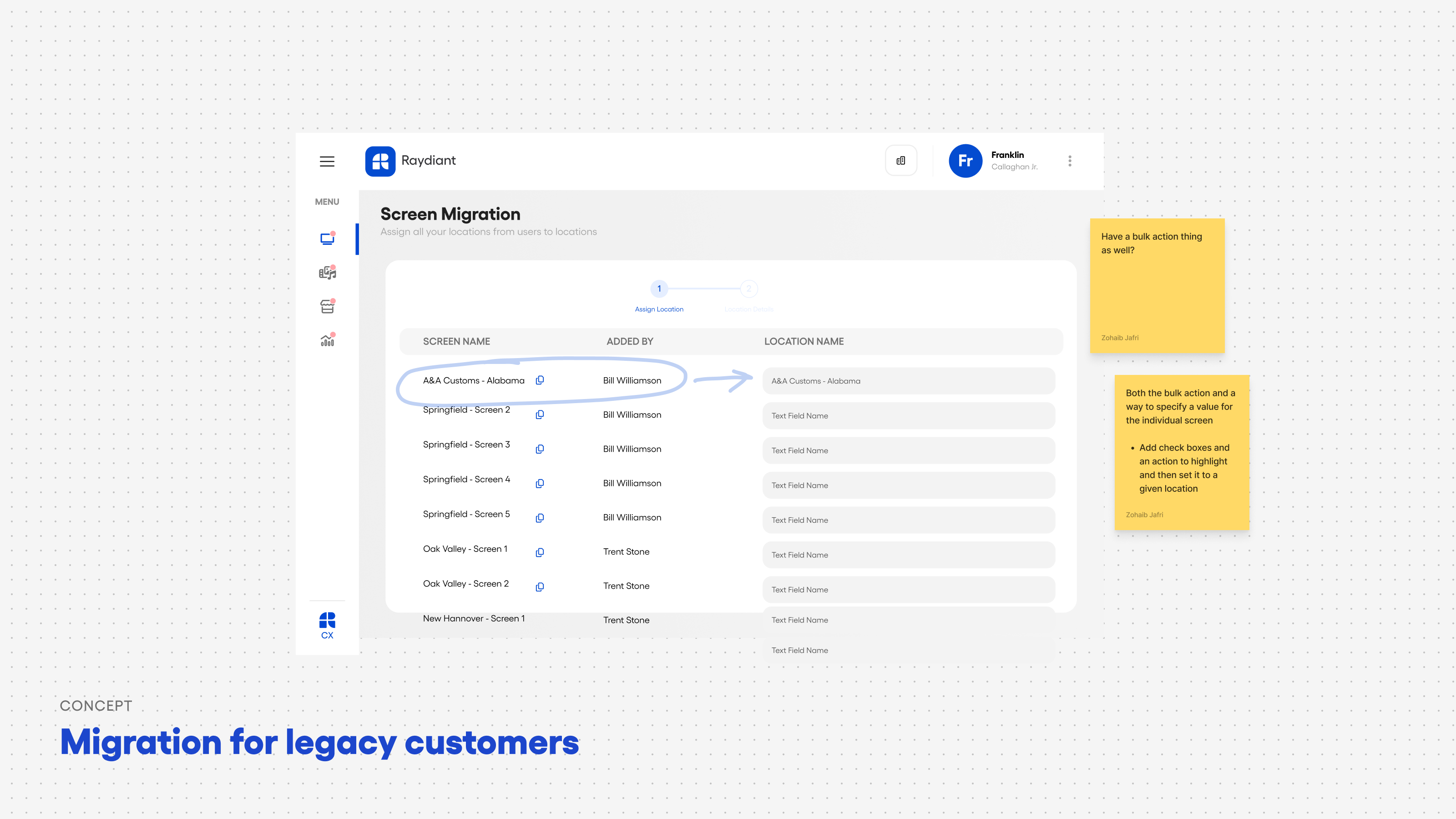
When migration for legacy users came up, I proposed a flow to create Locations and move screens. Leadership opted against investing in a one-off feature, so we explored alternative solutions.


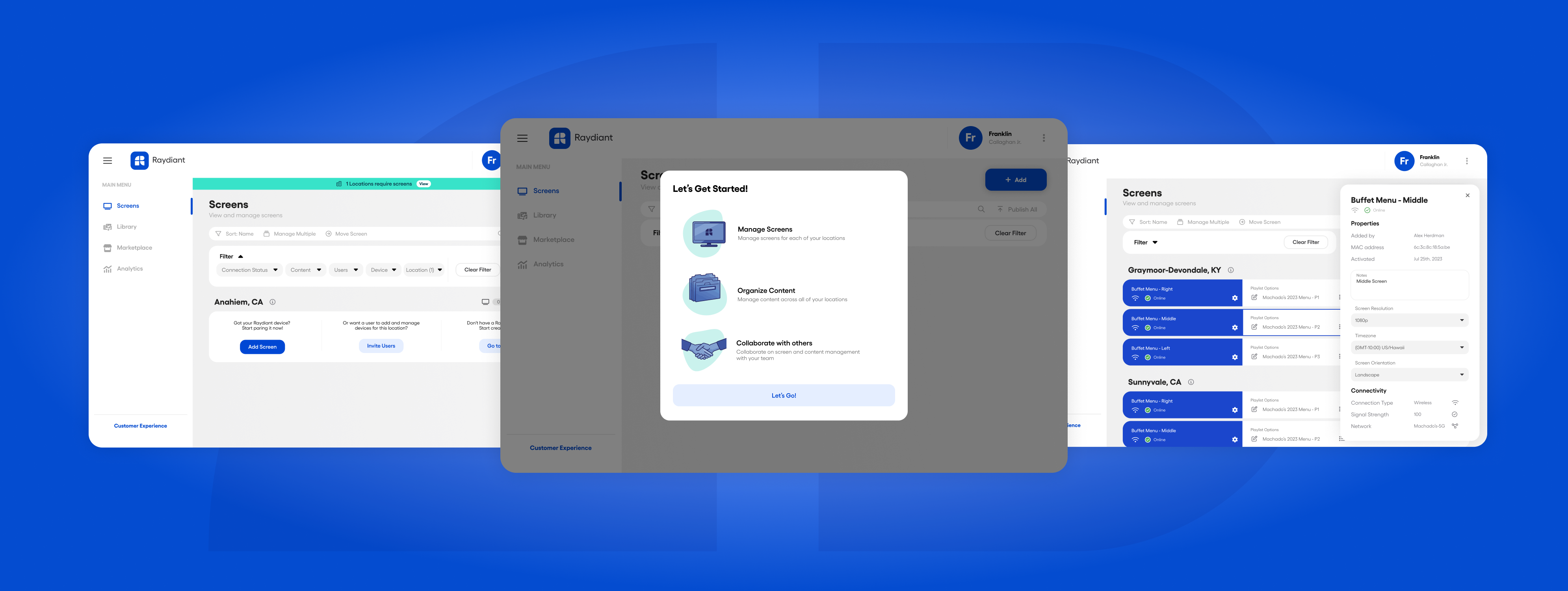
A foundational update to the platform that lets businesses organize and manage their screens and devices in a way that fits their workflow. It makes it easy to group devices, manage user access, and more — whether centrally from the corporate HQ or independently at each location.
🔊 Unmute and hear about the Locations feature from Raydiant's CSM, Vilen Gabrielyan
Clients can organize their screens in any way they want. This can be done as locales, regions, cities, etc. We would recommend something adjacent to locations, but the users have flexibility to make it anything they want. It could also be organized by users like legacy customers have or anything else customers can come up with!

Users can use the structure that works for their organization to organize and maintain their device fleet of screens, kiosks, and AI devices.

As requested by customers, we now support explicit access management for users within a specific location. This is a huge value add for franchise customers who want to limit access to specific franchises.

It's quick and easy to move things around. We know there can be employee turnover or hardware gets moved in between locations. We have made it super easy to move devices from one location to another, regardless of what the reason may be.

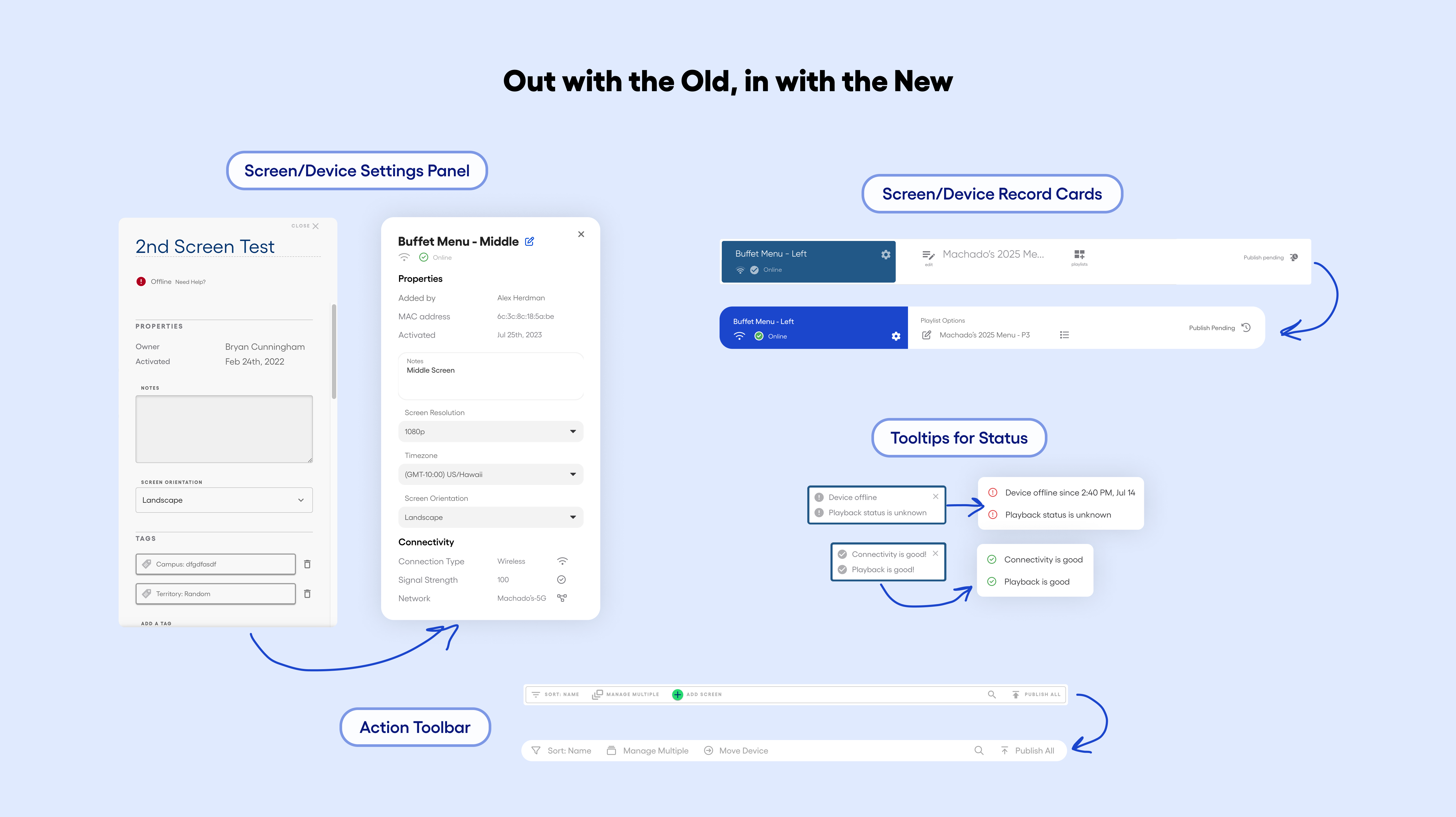
With Raydiant undergoing a corporate rebrand, we established a new design system. We did not want to make sweeping changes to the design as so many customers were used to the flows. We chose to make intentional updates, keeping the interactions similar but giving the platform a fresh new look.
I worked on some brand-new components for the screen cards, filter/action toolbars, and the device and playlist side panels. I worked closely with our lead front-end engineer to get all of these components into their Storybook repository.
We released the Locations feature with the engineering team, tracking performance and completion rates. We also set up key events and triggers based on technical requirements. This is a net-new feature that was served to targeted users.
The feature was met with an overwhelmingly positive reception. Users were excited that they could organize their screens their way. The support team saw a dip in their support tickets, saving them 25+ hours weekly. We also had a monthly active user uptick of 13% in the first month. Monitoring was ongoing, but the metrics above were consistent even 2 weeks post-launch.

Our biggest win on this project was helping the sales team close on key deals, adding three major logos into the fold: Church’s Texas Chicken, Walmart, and Subaru.

Going from MVP to an ideal state requires a lot of development that doesn’t always align with foreseeable business goals. There were a number of things that came up during the initial scoping that the product team is looking at now for the next phases:
This was quite a lengthy project, but one that I enjoyed a lot. It was tough having a PM change in the middle of the process after the original PM moved on from the company. I had to take the reins and bridge the gap. This allowed me to dabble in product strategy and really own the design.
At first, this feature was seen as relatively small in scope, and there was some hesitation from leadership about investing time in conducting research. Then it began to balloon in scope. With the research insights, we were able to build internal alignment to advocate for a better solution.
By using some simple methods like the value-complexity matrix, we got stakeholders and cross-functional teams on the same page to make intelligent compromises. This allowed us to launch an MVP that delivered value to both our clients and Raydiant, with a clear path for future improvements.
🎉 You made it to the end! Thanks for taking the time to read about this project.
Fraser Health — 6 Min Read
Check out the Process
Barclays — 5 Min Read
Check out the Process